Decision Tree Example: What do the Graphical Views tell me?
Colours
In all the views the colour coding used is as follows:
-
Red: Relates to people in the analysis selection.
- Blue: Relates to people not in the analysis selection.
In the graphical views, the intensity of the colour relates to the gain of the node, relative to the root node. The Gain is the ratio of the Analysis % in the node, to the Analysis % in the root. Nodes are coloured:
-
Red if the have a gain greater than 1. The more intense the red, the higher the proportion of people in the analysis selection.
-
Blue if they have a gain less than 1. The more intense the blue, the lower the proportion of people in the analysis selection.
- Grey if they have a gain around 1 (i.e. are in line with the root node). Note - if the root has a high Analysis %, (e.g. 70%), colours will tend to be grey or muted since gain figures will be closer to 1.
For more details see What do all the colours mean?
Box Tree and Organic Tree
The Box and Organic tree provide complementary views of the Decision Tree.
The Box Tree is useful for understanding the logical relationship between nodes. The splitting rule is displayed where possible and the parent / child relationship between nodes is emphasised.
.png)
For more details see What can I learn from the Box Tree?
The Organic Tree provides a statistical overview of the Decision Tree.
-
The width of a branch is proportional to the number of people in that node.
-
The angle of a branch indicates how significant the difference in Analysis % within the branch is compared to its parent.
A branch almost in line with its parent, does not differ that significantly in Analysis %.
A branch sticking out at a large angle, shows a significant difference in Analysis %.
_846x417.png)
See also How do I interpret the Organic Tree?
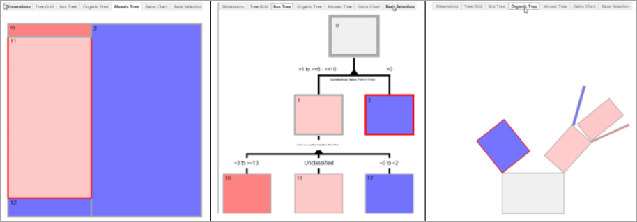
A 3rd graphical view is available - referred to as a Mosaic Tree - which particularly helps you to visualise the volumes and quality of the end 'leaf' nodes.

In the above screenshot we see all three views - Mosaic, Box and Organic. As there are 4 leaf nodes in this example, the Mosaic view has 4 shaded areas, each providing a representation of the volume in its corresponding node. The shading is the same as in the other visualisations with darker red representing hot(ter) prospects and darker blue cold(er) prospects.