Bing Maps: Selectable Plot Map Legend
A plot map allows you to display records in a very granular way using, for example, UK Postcode to create geographical boundaries and allowing you to examine the distribution and location of smaller groups of existing customers or prospects.
The Plot Map below displays the distribution of the 160 Directors who read the Financial Times:
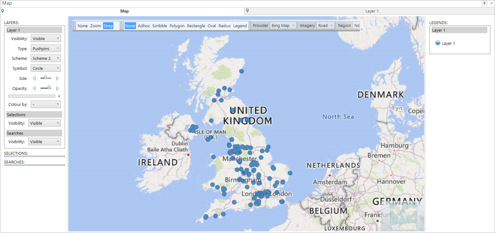
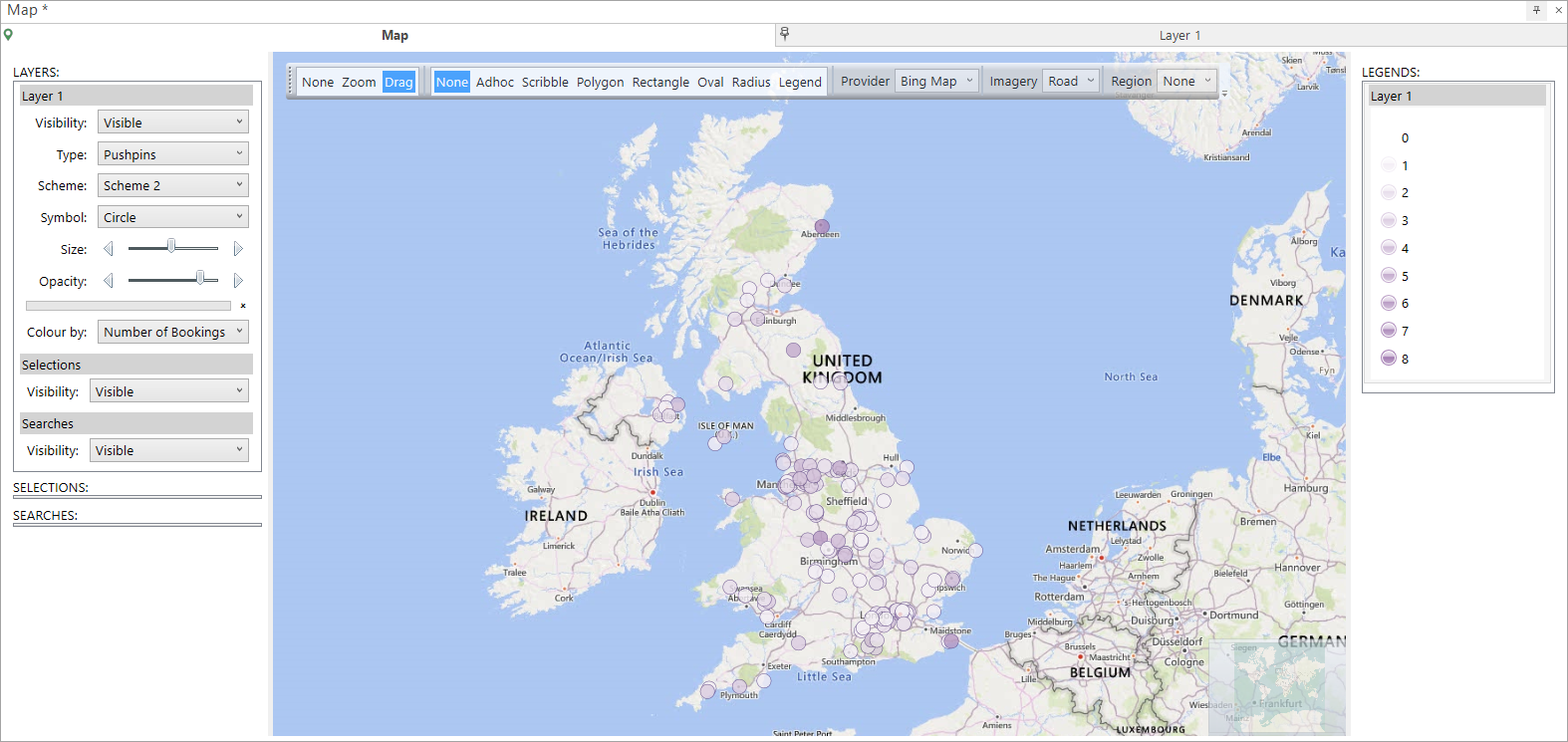
Notice that the legend on the right simply indicates Layer 1 and that the pins in the map itself are coloured according to the scheme selected in the Layer 1 panel on the left.
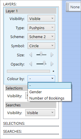
In this example, two additional selector type variables have been added into the Layer 1 settings - Gender and Number of Bookings:

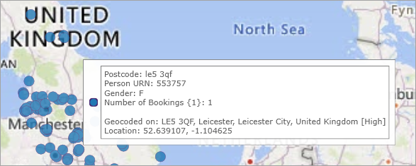
When you hover over a pin on the map, the relevant information is displayed:
In the Layers panel, you also have the option to Colour by either of these additional variables:
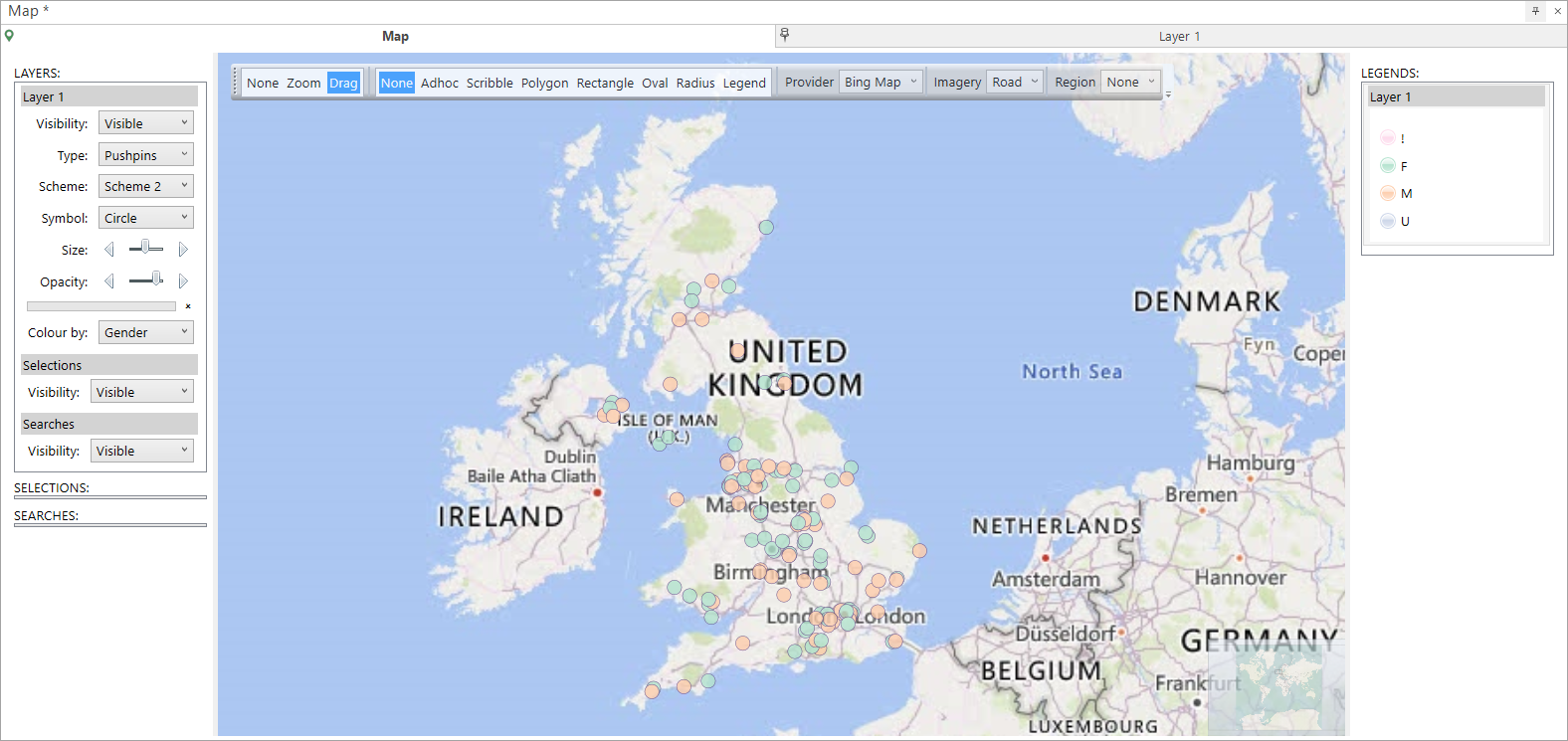
In this example, when you select Gender, the categories and colours in the Legends panel update and are applied to the pins on the map. There is no order to this variable.
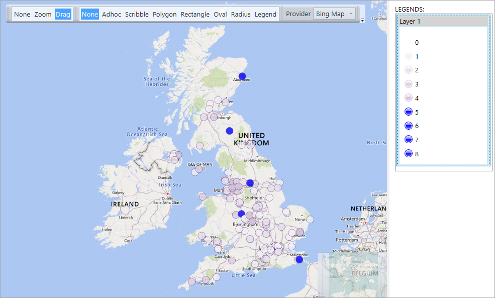
However, when you "Colour by" any selector that has an order to it - such as Number of Bookings - ordered coloured shading is automatically applied to the categories within the legend.
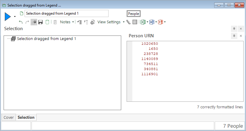
In both cases, you can use the legend to highlight categories of interest and then, using the Legend mode at the top of the display, create a selection and drag-off file of those URNs:
Back to Bing Maps: Plot Map
Related topics: