Bing Maps: Shaded Map - Using a Segment Variable
When using the shaded map option, you can display segmented data from a selector variable or selection query. For example, you may wish to create a graphical display of the occupations of your customers by the Postal Area in which they live.
-
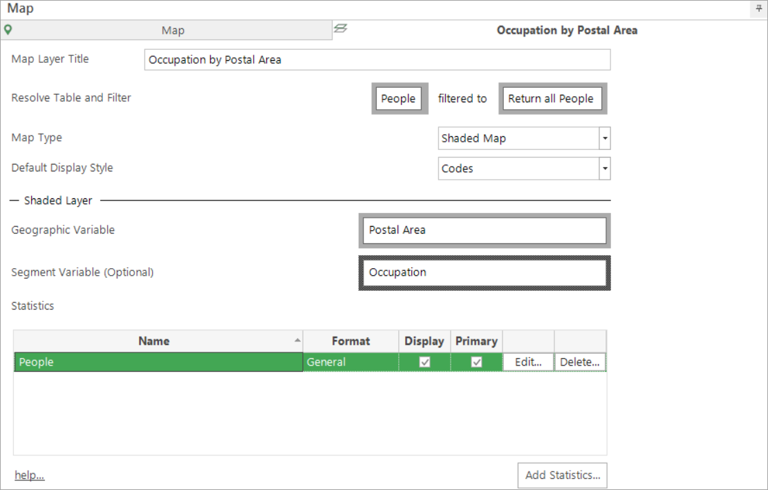
Using a blank selection drag on the Map tool and change the Layer 1 tab to reflect the options in the screen shot below:
- Click the Build button
The default display uses a sized pie chart to show the categories of the variable. The legend indicates the colour coding used to identify each of the segments.

Use the Layers panel on the left of the screen to access the different chart "Type" options.
Move the mouse pointer over a chart on the map to display the count for each category of the variable used. In this example the number of people in Coventry by which Occupation category they are in.

If a specific segment of the pie chart is touched by the mouse pointer the name and percentage of that segment will be displayed.
For information on adding statistics, see Bing Maps: Shaded Map - Adding Statistics