Numeric Banding: Chart View
The Chart View provides a graphical view of the distribution of a numeric variable.
.png)
It provides the user with the ability to zoom in and out of the data and to pan across the range of numeric values. A tool-tip provides information about each individual interval.
Zoom Controls
The Zoom Controls appear on the right hand side of the chart whenever the range of the numeric variable is sufficiently large.
.png)
|
The
The
The |
.png) and
and .png) buttons at either end of the slider control, and the slider control itself, allow you to zoom in and out gradually. When zooming in, the chart zooms in initially keeping the main data in the centre of the view. On higher magnification, zooming in maintains the centre of view.
buttons at either end of the slider control, and the slider control itself, allow you to zoom in and out gradually. When zooming in, the chart zooms in initially keeping the main data in the centre of the view. On higher magnification, zooming in maintains the centre of view..png) button zooms out fully so that the full range of
numeric values are displayed.
button zooms out fully so that the full range of
numeric values are displayed.The automatic zoom button is very useful to zoom in to the main intervals, whereas the zoom out fully button provides an easy way to see the full range of the data, providing an appreciation of where the main bulk of data is in relation to the full range of values.
|
|
|
.png)
.png)
Display of the Different Distribution Types
There are two main types of display: Frequency Counts and Density.
1. Equal Ranges are displayed on Frequency charts. These have blue bars by default. The height of the bar is proportional to the count of records within each interval, as shown on the vertical axis. These counts can only be shown because the bars are of equal width.
.png)
2. Quantiles and Geometric Ranges are displayed on a Density chart. This has green bars by default. The area of the bar in a Density chart is proportional to the count of records within each interval. This is because the width of the bars varies depending on the range of values covered by the interval. No scale is displayed on the vertical axis, since the height of the bar does not relate to a particular count.
The example below shows Quantile ranges. The width of the ranges, and therefore the bars, varies considerably. However, being quantiles, all the bars in the chart below have the same count. You can think of the bars as either squashing these records in to tall thin bars or spreading them out across short wide bars.
.png)
Additional display styles are used for the following:
3. Extended ranges are displayed as a hashed bars and contain the extreme values at either end of the banding. These bars are wider than the other bars and so they cannot be given a specific height to represent the count of records.
.png)
The extended range is displayed from the point at which the main ranges end and continue as far as the minimum and maximum values. They are displayed as a shaded region of the chart and reach to the full height of the chart irrespective of the count.
The Advanced Options allow extreme values (beyond the start and end values of the main ranges) to be either left unclassified or to be included in the banding within these extended intervals.
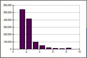
4. Integer ranges are displayed by default in purple. A small gap is left between bars. This may not be visible low zoom.
Panning with the Scroll Bar
The scroll bar enables you to move along the range of the numeric variable. It is only visible having zoomed in.