Workbook maps
Audience workbook maps display with shapes coloured according to the population.
Explainer: Workbook maps
The colour scheme displayed here uses quantiles. Dashboards display colour using absolute shading, which divides equally across your customer set. In contrast, quantiles divide your data into equal-sized groups. Quantile views provide a more balanced and insightful view of your data, another improvement from dashboard maps.
In the example above, each colour shade represents an equal number of data points, corresponding to an equal proportion of your customer base.
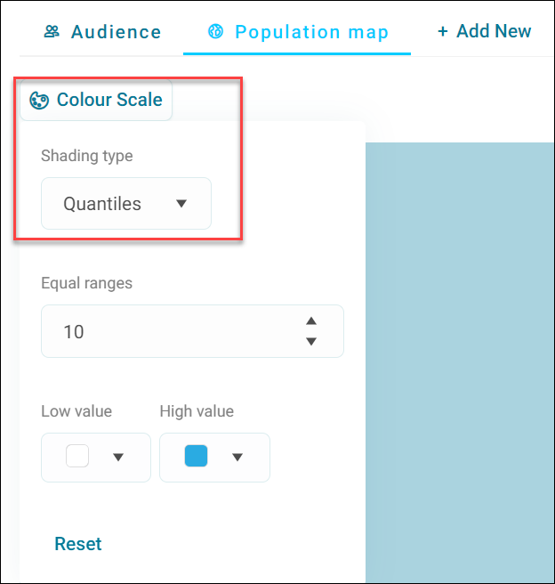
Quantiles help minimise the negative impact of outliers by spreading your data more evenly, so that outliers don't dominate the visual representation of your data.
Absolute data is heavily influenced by outliers, which are well outside the normal range.
In marketing, using quantiles is better for decision making as relative performance is more important than absolute numbers. In this example, using quantiles you can see which regions are performing better relative to others, substantially aiding your targeting efforts.
To create an audience workbook map:
- Select + New Audience.
- Provide an Audience Name and select Create.
-
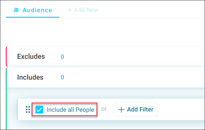
Tick the Include all People checkbox.
-
Select + New Page, to create a new audience workbook tab.
- Under the new tab Tools menu, select Map.
- Provide a Map Name and select Create.
-
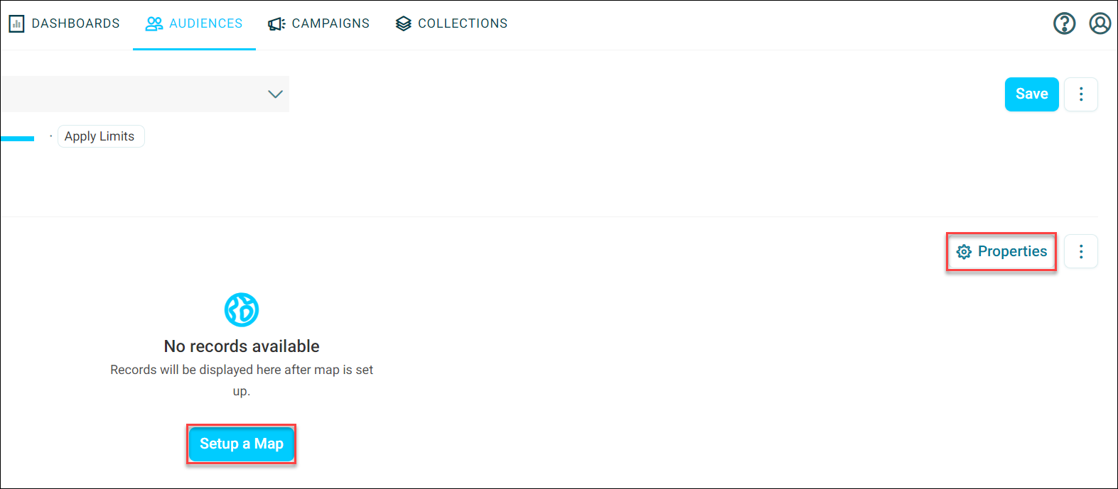
Select Setup a Map or Properties to open the Map Properties side panel.
-
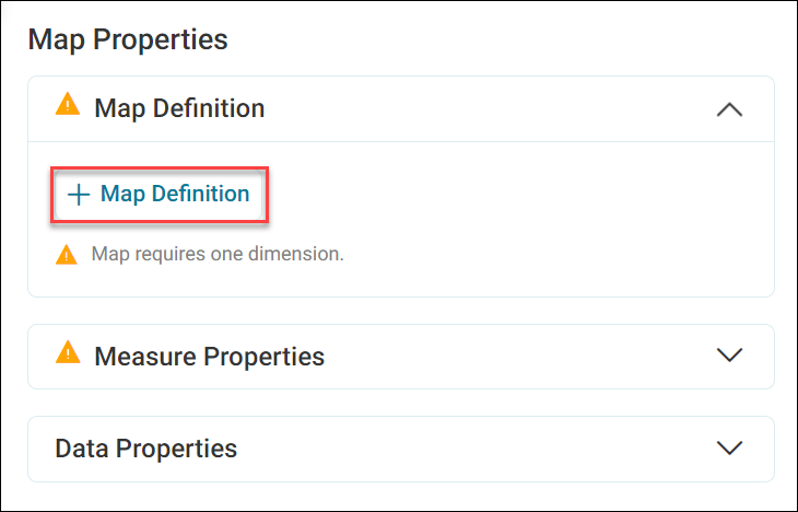
On the Map Properties side panel, select + Map Definition.
-
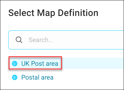
Search for and select your preferred Map Definition.
-
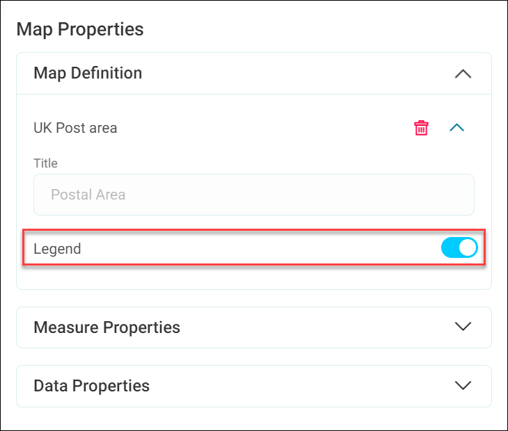
Toggle the Legend switch and select Apply.
You've now completed your audience workbook map.
The map is zoomable and panable, and has outlines enabled. Apteco provides the background free of charge, via OpenStreetMap.