Charts in audiences
You can use powerful full-screen chart visualisations in Orbit audience workbooks to fully visualise your analytics.
For a new or existing audience, you can add a variety of chart types. You can then define your dimensions, measures, and data properties using the intuitive chart properties side panel. Once you've added and defined a chart, you can select a cross-section of your data from the chart to create new audiences.
Example use case
In the line chart below, the example selects the first quarter of each month.
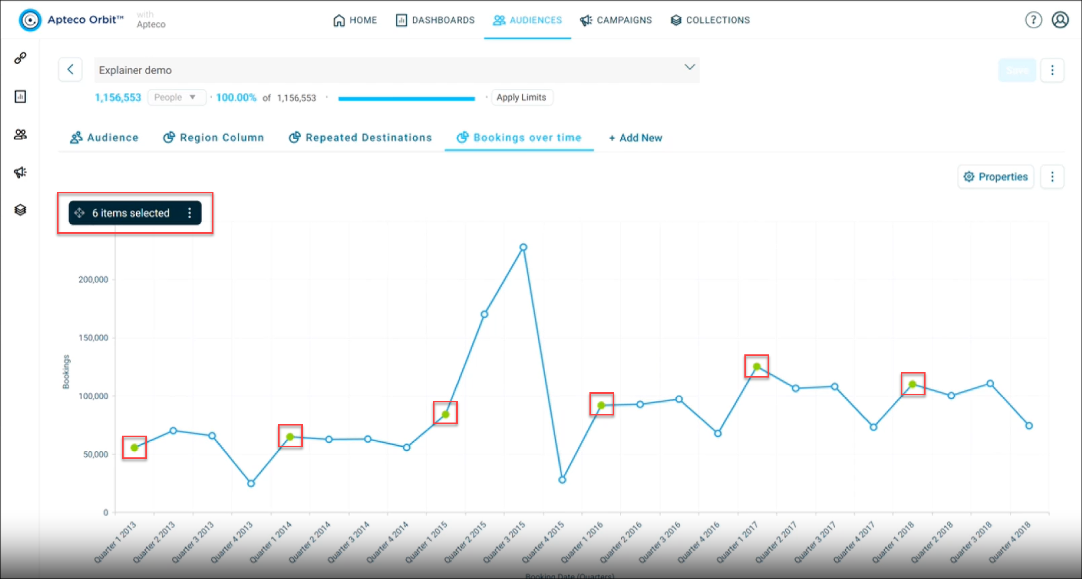
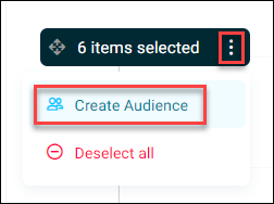
Using the selection menu, you can then use these selections to create a new audience.
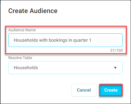
Provide an Audience Name and select Create to complete your audience.
Add a chart to an audience
To add a chart to an audience:
- Go to Audiences.
- Create a new audience, or open an existing audience.
- Select + New Page.
-
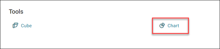
Under the Tools menu in the bottom right of your screen, select Chart.
-
Enter your Chart Name, and select Create.
You've now created a chart and can proceed to set it up.
Setup a chart
To setup a chart:
- Select Setup a Chart or Properties. Either of these options open the Chart Properties side panel.
-
Use the Chart Properties side panel to configure your chart.
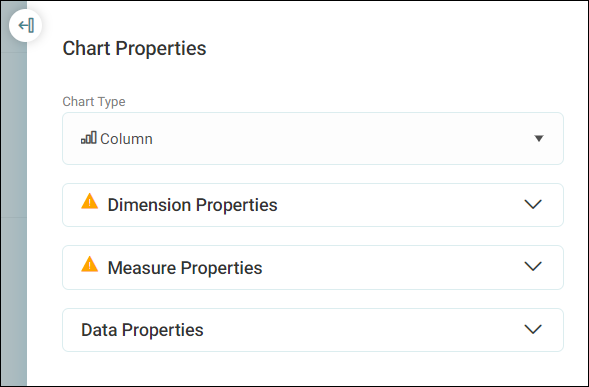
Chart properties
The chart properties side panel lets you configure your charts.
Chart properties consist of the following criteria:
- Chart Type
- Dimension Properties
- Measure Properties
- Data Properties
Chart type
To add a chart type:
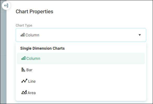
- Open the Chart Type drop down.
-
Select your preferred chart type.
Dimension properties
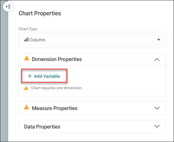
Dimension properties let you add a dimension to your chart and refine it.
Note
A chart requires at least one dimension.
To add a dimension:
-
Select + Add Variable.
-
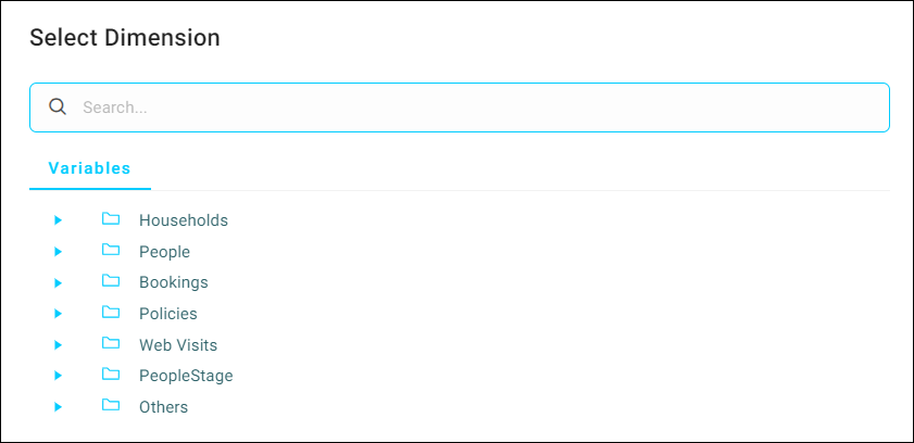
Search for and select your preferred dimension.
-
You're then presented with further options to define your dimension.
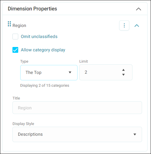
-
Apply any filters you want to your dimension.
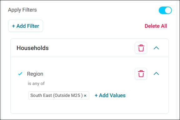
-
Select Apply.
Measure properties
In measure properties, you can add a measure or calculated measure to your chart.
Note
Combo charts use one dimension and two measures. For example, choose a dimension of region and a default measure of households. Add a second measure of sum of cost to create the chart below:
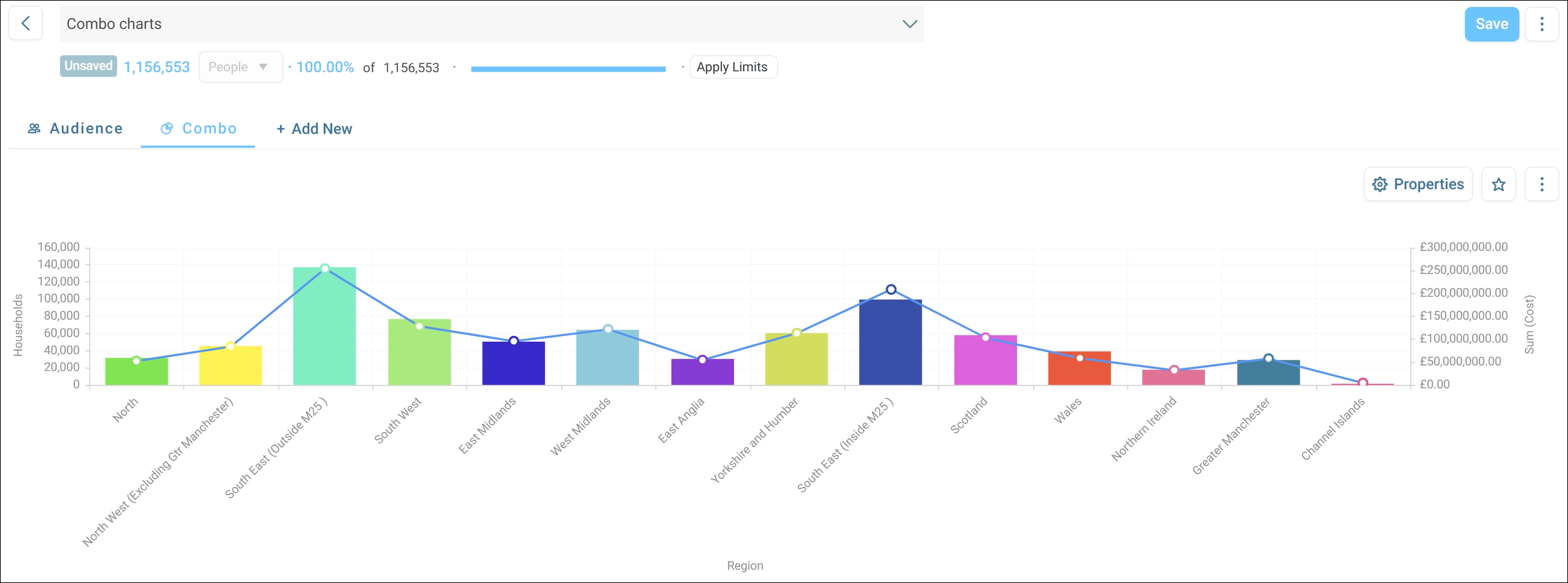
Measures
Note
A chart requires at least one measure.
To add a measure:
-
Select + Add Measure.
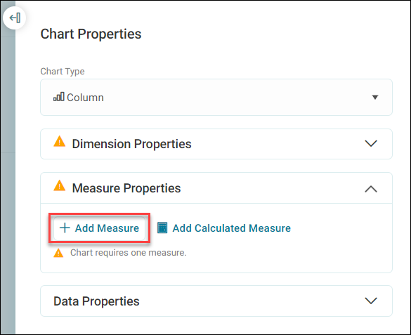
-
Search for and select your preferred measure.
- You're then presented with further options to define your measure.
-
Apply any filters you want to your measure.
-
Select Apply.
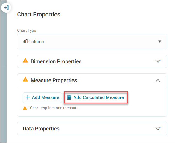
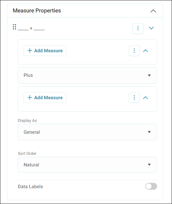
Calculated measures
To add a calculated measure:
-
Select Add Calculated Measure.
-
You're then presented with further options to define your measure. For more information, see Calculated Measures.
Data properties
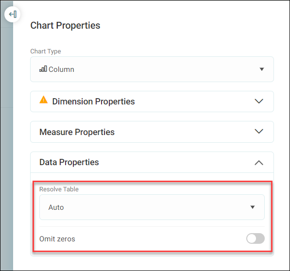
Data properties let you apply a resolve table to your chart, or omit zeros. Resolve tables apply custom counting logic to tailor how your chart visualisation counts or aggregates your data.
To add data properties:
- Use the Resolve Table drop down menu to select your preferred option.
-
Use the toggle switch to Omit zeros, or not.
Selections
Once you have created and defined your chart, you can then select a cross section of your data to create a new audience.